
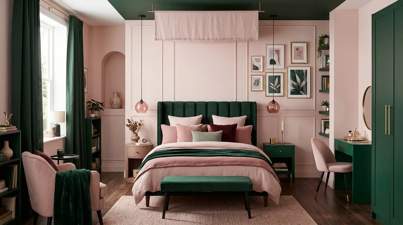
21 Striking Pink and Dark Green Bedroom Ideas to Love
A bold bedroom can still feel warm, balanced, and easy to live with. A Pink and dark green bedroom brings together softness and depth, creating a look that feels stylish without becoming overwhelming.
This article shares 21 practical ways to combine these two colors through walls, bedding, furniture, lighting, storage, and smaller decorative details. The ideas are designed to work especially well in compact bedrooms where every color and furniture choice matters. In my experience, the strongest rooms do not rely on covering every surface with color. Instead, they repeat a few carefully chosen shades in different areas. Whether you prefer a softer blush look or a moodier forest green scheme, these ideas will help you build a bedroom that feels coordinated, personal, and comfortable.
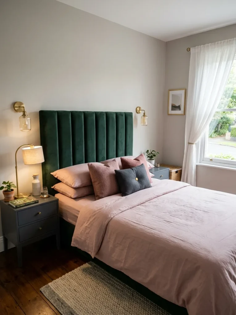
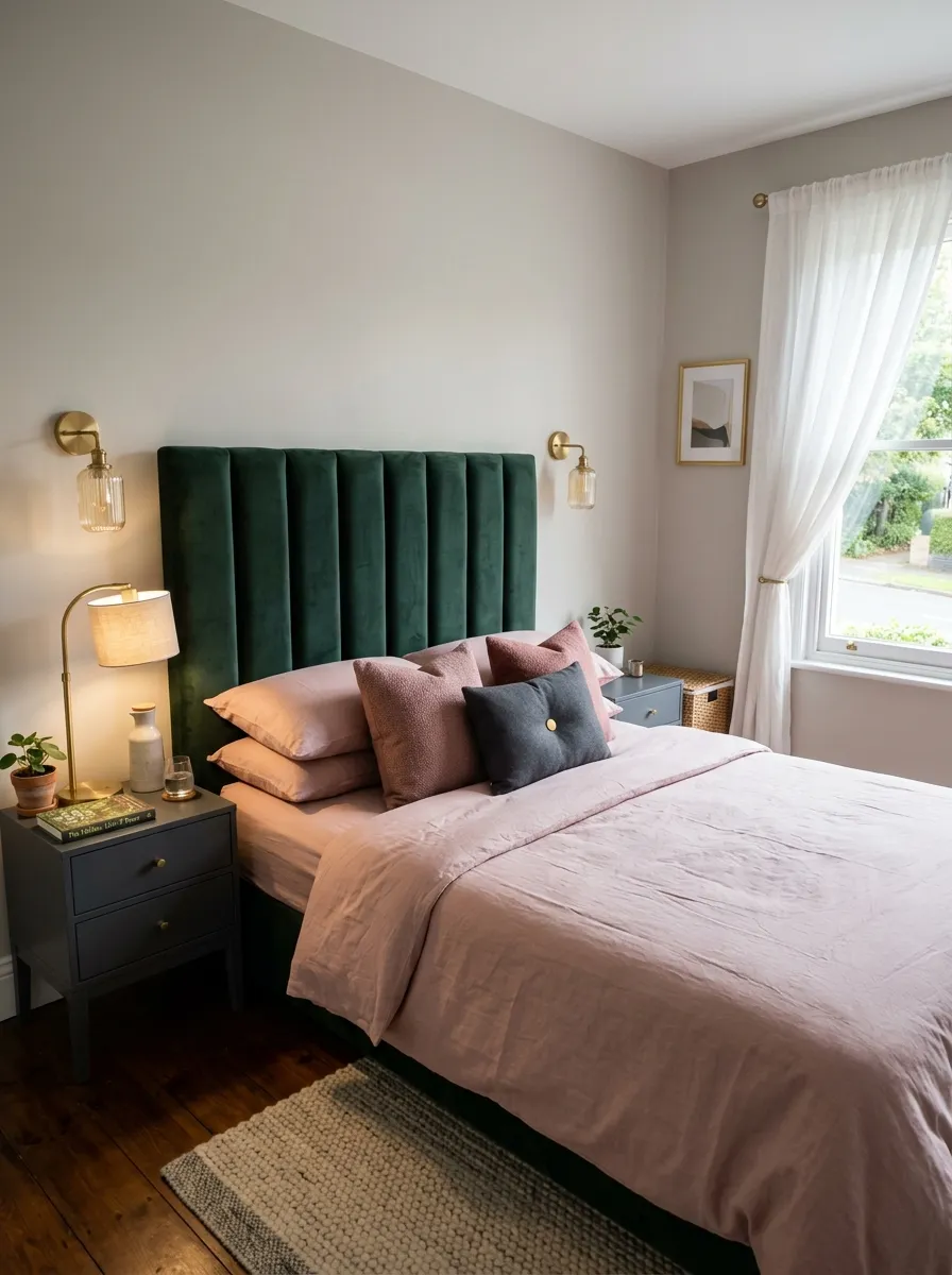
Forest Green Headboard
A deep green headboard gives the room an instant focal point without requiring a full makeover. Pair it with soft pink bedding, a muted rose throw, and just one or two deeper green accents so the contrast stays balanced. Velvet works especially well because it adds richness without extra clutter.
In my experience, this approach is useful in smaller bedrooms because the bed carries most of the color story. Keep surrounding furniture simple in charcoal, walnut, or black. The result feels bold and polished while still being practical for everyday living.
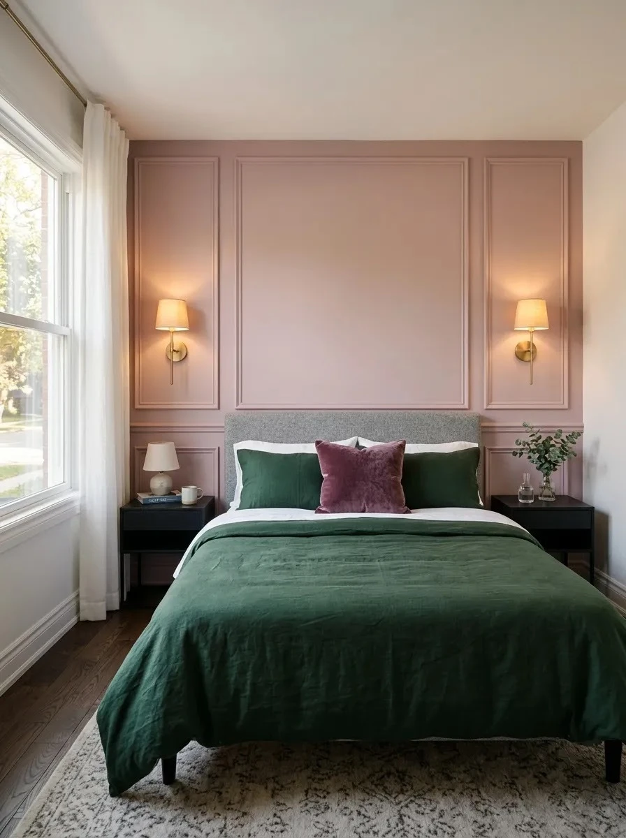
Rose Panel Molding
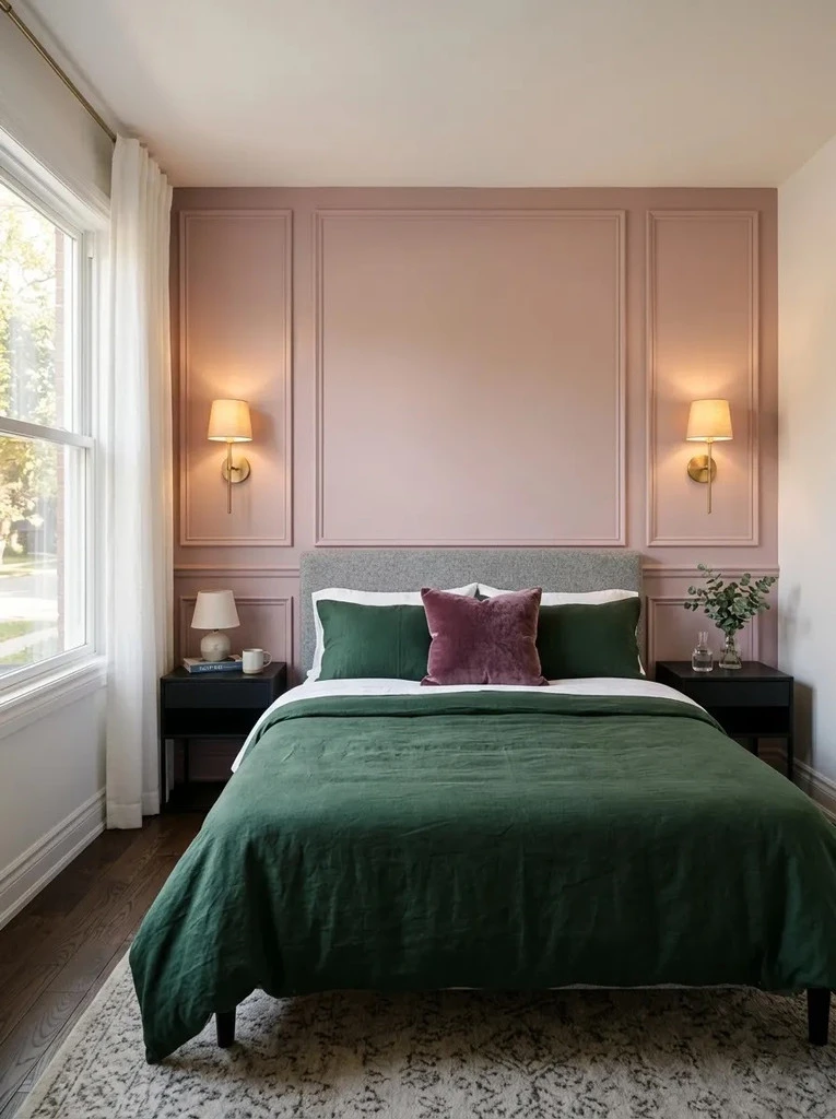
- Paint only the paneled wall in dusty rose so the room does not feel overly pink.
- Choose a muted or chalky finish rather than a bright candy tone for a more grown-up look.
- Bring in dark green through the duvet, lumbar cushion, or folded blanket.
- Keep lamps and hardware black or brass to create a clean visual break.
- Use slim molding profiles in small rooms so the wall gains depth without looking heavy.
Wall paneling gives a pink and dark green bedroom more structure because the colors feel connected to an architectural feature rather than scattered around the room. I’ve noticed that keeping the darker shade mainly on textiles also makes future color changes much easier and more affordable.
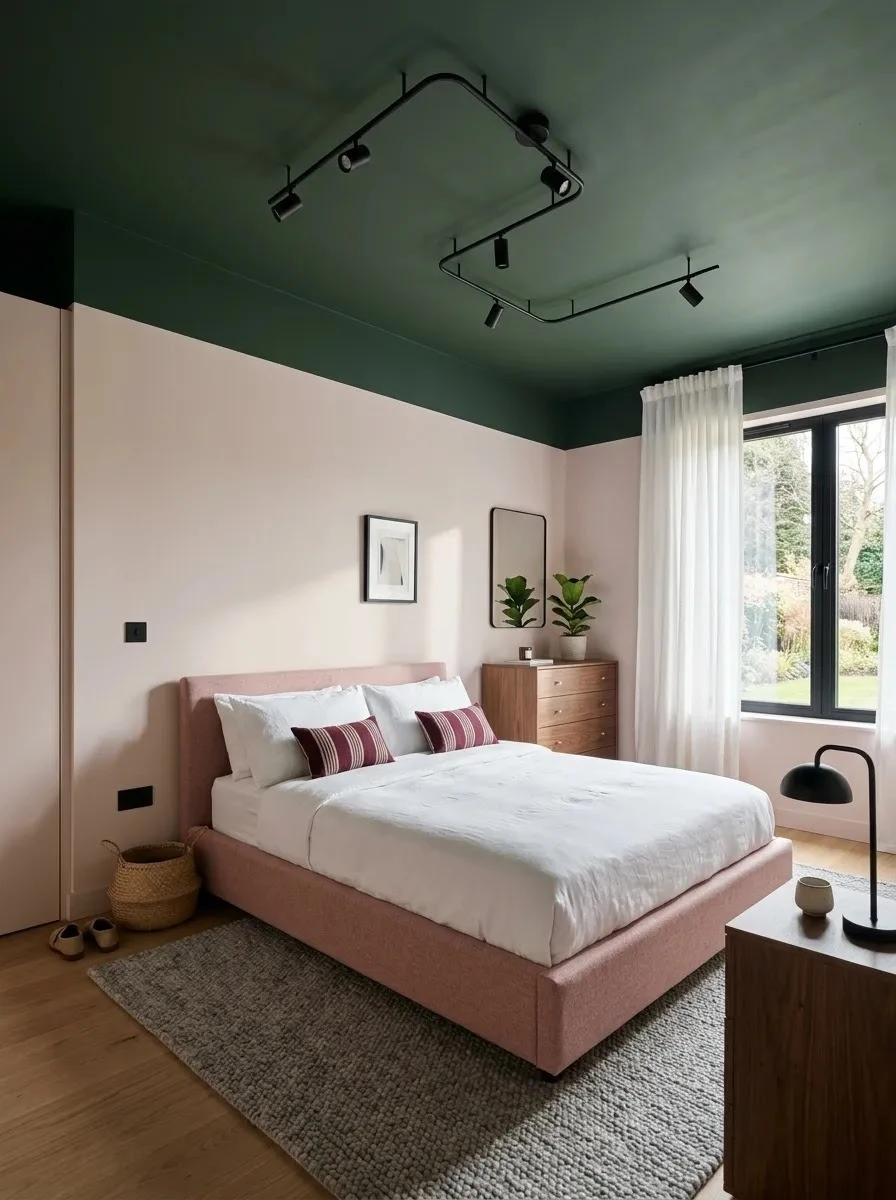
Green Ceiling Accent
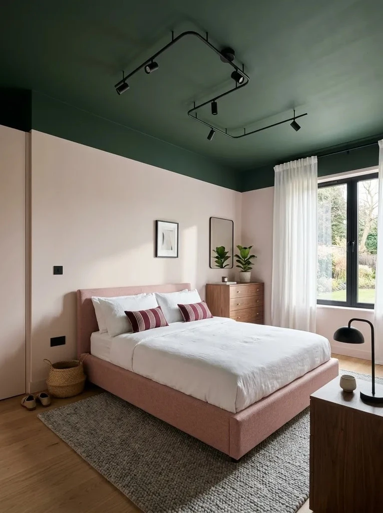
Quick Tip:
Use a flat or matte dark green finish on the ceiling because glossy paint can make overhead imperfections more noticeable. Keep the walls several shades lighter so the ceiling feels intentional rather than visually heavy.
Painting the ceiling is especially useful when floor space is limited because it adds drama without introducing another piece of furniture. Pair the overhead green with small matching details near eye level, such as piping, artwork, or a lampshade. This repetition keeps the color scheme connected and visually controlled.
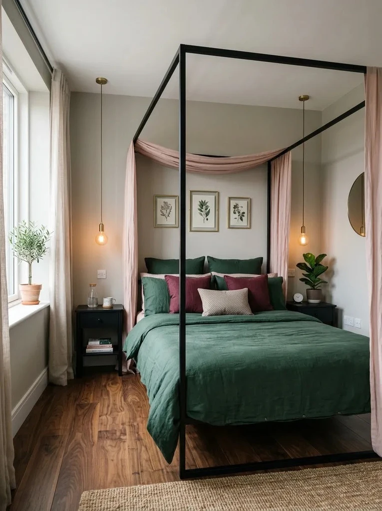
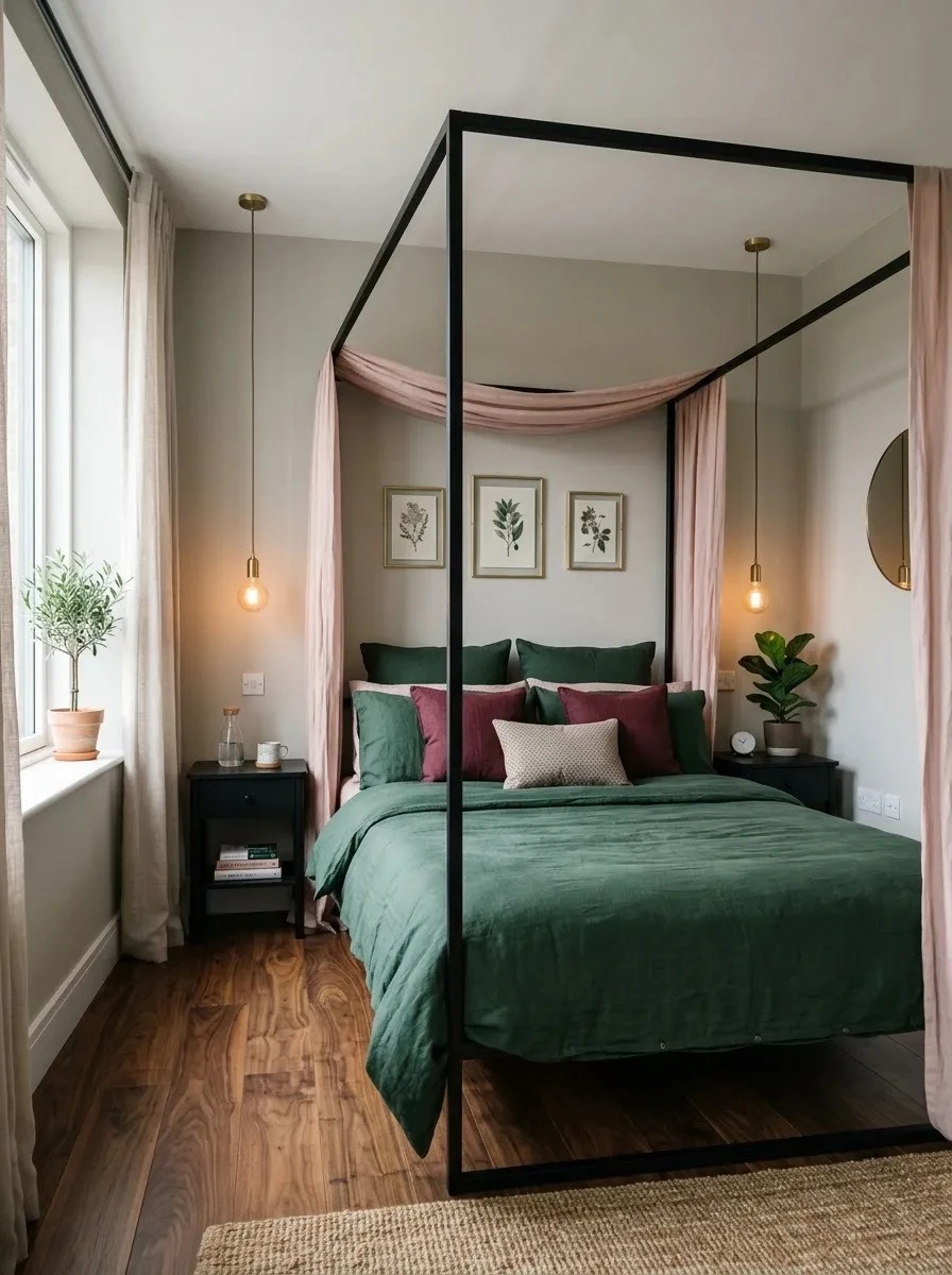
Blush Bed Canopy
BEFORE:
The bedroom feels flat because the pink and green colors sit separately with no strong feature connecting them. The bed blends into the room instead of becoming the main visual anchor.
AFTER:
A blush canopy creates a clear focal point while deep green bedding adds contrast beneath it. The room feels more layered, intentional, and visually balanced without needing extra furniture.
A lightweight canopy works best in small bedrooms because it adds softness without taking up floor space. Keep the fabric simple and avoid heavy draping. Pairing pale pink overhead with darker green below also helps distribute color vertically, making the room feel designed from top to bottom.
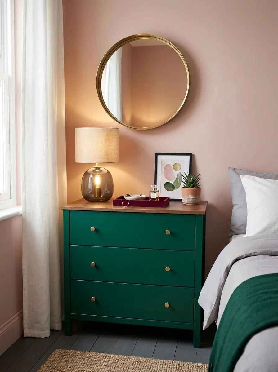
Emerald Dresser Moment
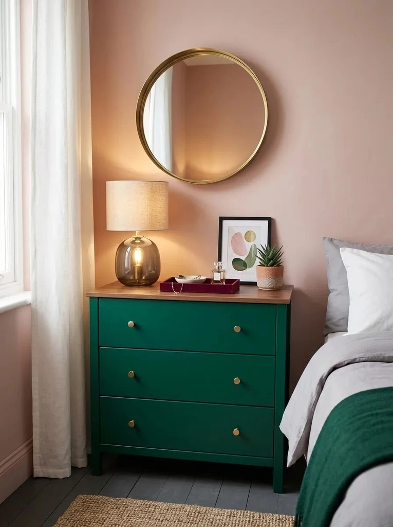
- Choose a compact dresser with clean lines so the strong green color does not overwhelm the room.
- Place it against a muted pink wall for a clear two-color contrast.
- Add brass or black hardware to sharpen the look.
- Keep styling minimal with a lamp, mirror, and one decorative tray.
- Repeat the dresser color once elsewhere through a cushion or throw.
A painted dresser gives you a bold color moment without committing to an entire dark green wall. I’ve seen this work especially well in rental bedrooms where permanent changes are limited. It also gives older furniture a fresh purpose while keeping the overall palette focused and affordable.
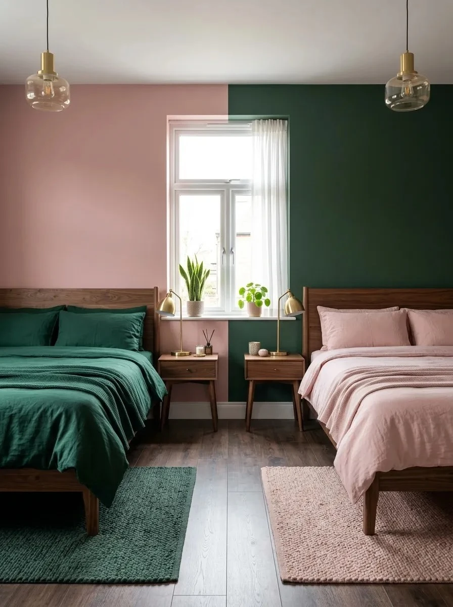
Pink Walls vs Green Walls
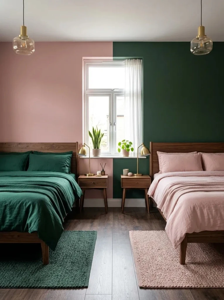
| Feature | Pink Walls | Green Walls |
| Overall Feel | Softer and lighter | Richer and moodier |
| Best Accent | Dark green bedding | Blush and dusty rose textiles |
| Small Room Effect | Feels more open | Feels more cocooning |
| Furniture Match | Walnut or black | Light wood or brass |
Both approaches can work, but the balance changes depending on how much natural light the bedroom receives. Pink walls usually keep a compact room brighter, while dark green walls create stronger depth. For budget-conscious decorating, choose the wall color first, then build the second shade through removable textiles and decor.
Velvet Bench Contrast
DO:
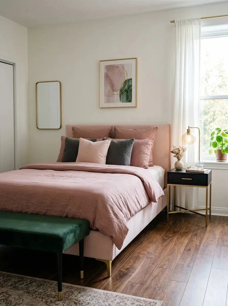
- Choose a narrow bench that leaves enough walking space around the bed.
- Repeat the green tone once through a cushion, lamp, or artwork.
- Keep the pink bedding slightly muted rather than overly bright.
- Use dark legs or hardware to connect the bench with nearby furniture.
DON’T:
- Pick an oversized bench that makes the room feel cramped.
- Add too many competing accent colors.
- Cover the bench with extra decor that reduces its usefulness.
- Use several different green shades without a clear visual connection.
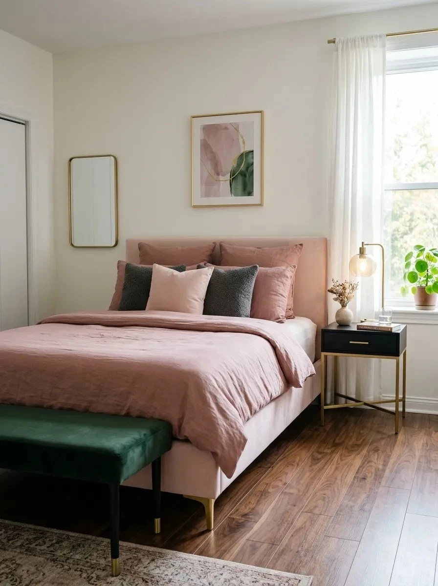
A bench works especially well when the room needs both function and contrast. It can hold folded blankets, provide a place to sit, and strengthen the color palette at the same time. In smaller bedrooms, I prefer designs with open legs because they keep more floor visible.
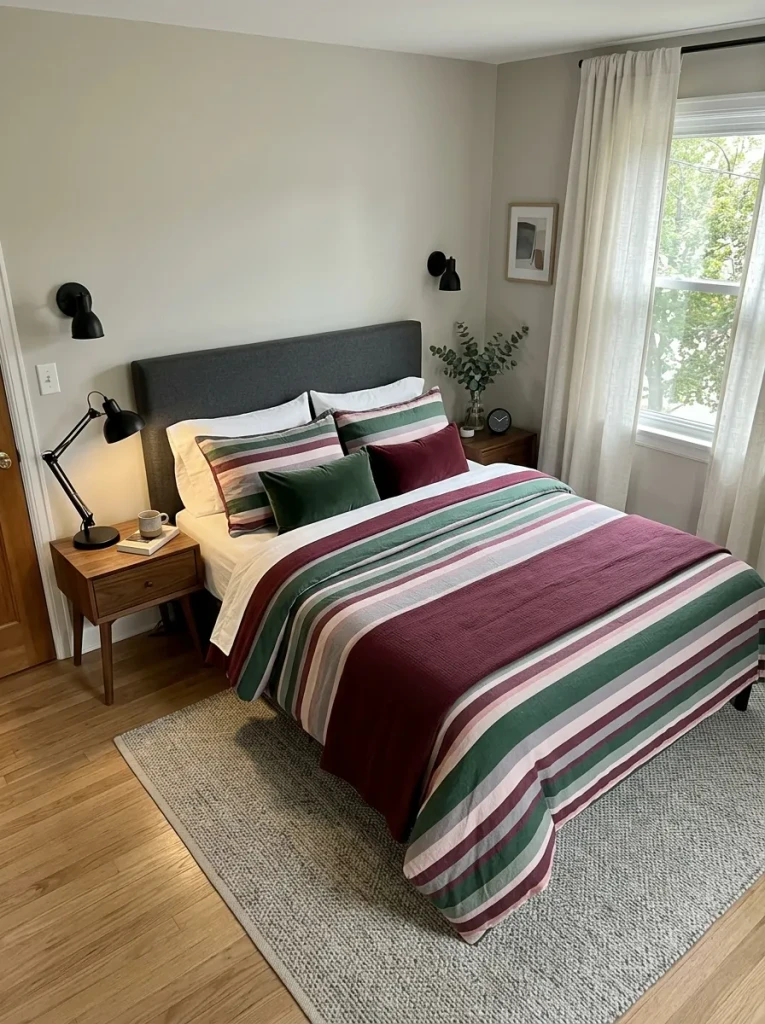
Striped Accent Bedding
Cost: Low to Medium
Time: 20 to 30 minutes
Skill Level: Beginner
Best For: Bedrooms needing more pattern without new furniture
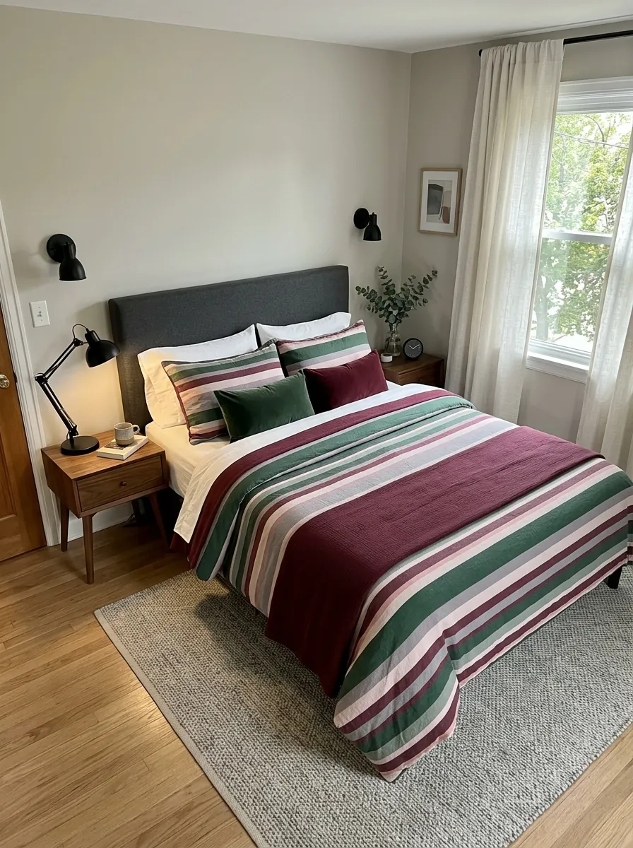
Striped bedding brings both main colors together in one place, which makes the rest of the room easier to style. Look for broad or uneven stripes rather than tiny busy patterns. Keeping sheets and larger furniture simple also prevents the palette from becoming visually noisy, especially in a compact bedroom
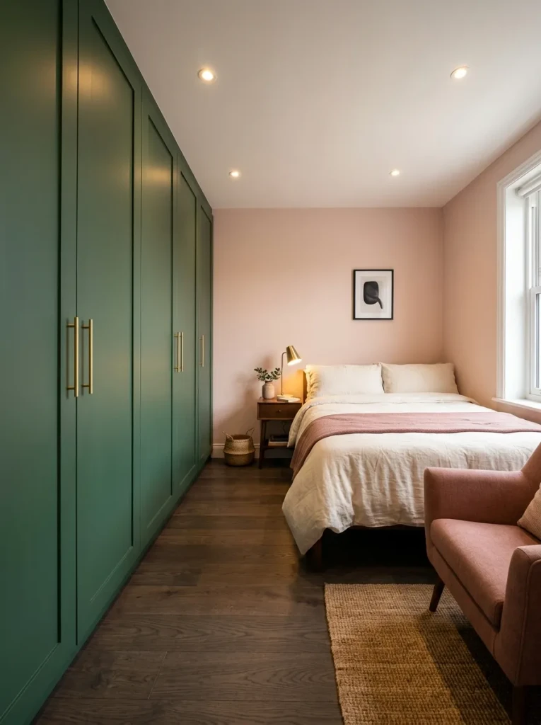
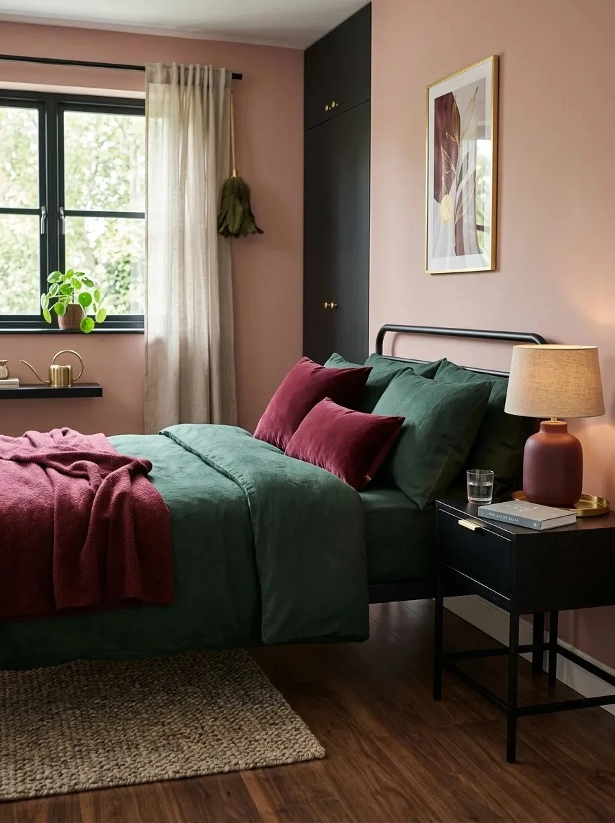
Deep Green Wardrobe
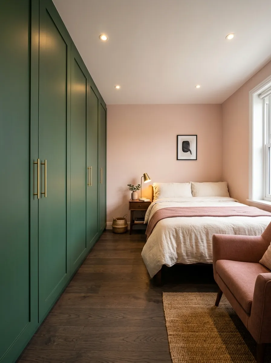
A dark green wardrobe can act like a feature wall while still providing valuable storage. Choosing a matte finish keeps the large surface from feeling too reflective, while slim brass or black handles add definition. Soft pink walls around it help the cabinetry feel rich rather than overpowering.
I’ve noticed this works best when the wardrobe doors stay visually simple. Avoid heavy paneling or too many decorative details on a large unit. Repeat the green subtly elsewhere, then let blush textiles and warm wood soften the darker storage wall
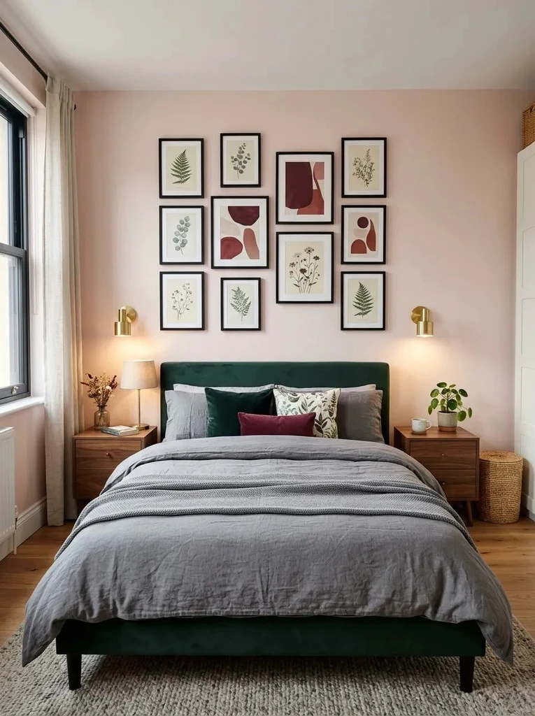
Blush Gallery Wall
- Mix blush, burgundy, green, and charcoal artwork so the wall feels coordinated without looking overly matched.
- Use slim black or brass frames to create a clean boundary around softer colors.
- Keep the arrangement slightly narrower than the bed for better visual proportion.
- Combine abstract prints with simple botanical or geometric pieces for variety.
- Leave enough empty wall space between frames so the display does not feel crowded.
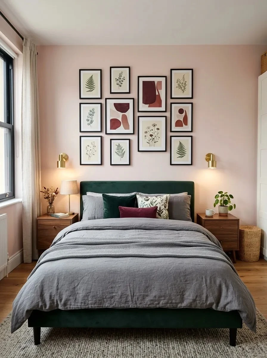
A gallery wall adds personality without taking up valuable floor space. I have noticed that limiting the artwork to three or four recurring colors keeps the room calmer and more intentional. For a budget-friendly update, printable art and secondhand frames can create the same layered effect for much less.
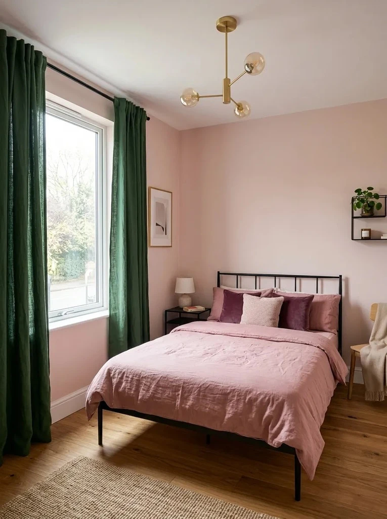
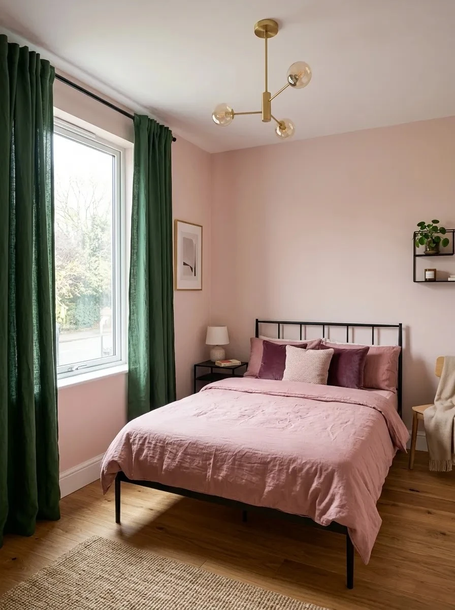
Green Window Drapes
Quick Tip:
Hang the curtain rod slightly above and wider than the window frame. This makes the window appear larger and allows more daylight into the room when the curtains are open.
Dark green curtains create a strong vertical color feature without permanently changing the walls. Choose fabric with a soft weave rather than a heavy glossy finish, especially in a small room. Pair them with lighter pink surfaces and restrained bedding so the window treatment feels dramatic without making the space too dark.
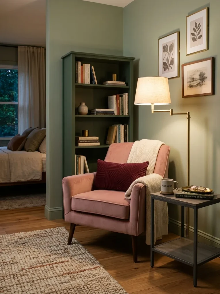
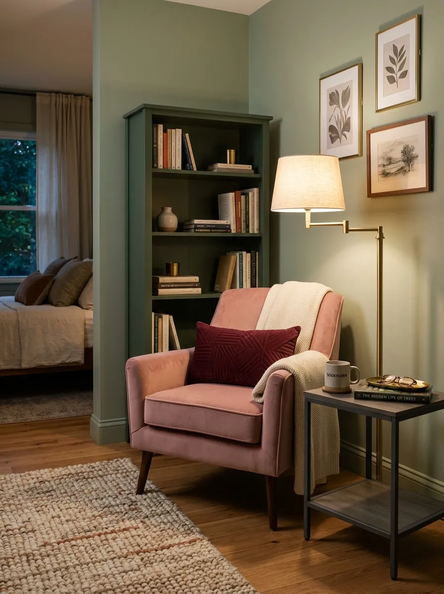
Pink Reading Nook
BEFORE:
An unused bedroom corner feels empty and disconnected from the rest of the color scheme. Small items may collect there without creating any real function.
AFTER:
A compact pink chair, dark green shelving, and focused lighting turn the corner into a useful reading spot. The two main colors gain another balanced focal point away from the bed.
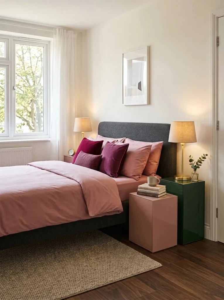
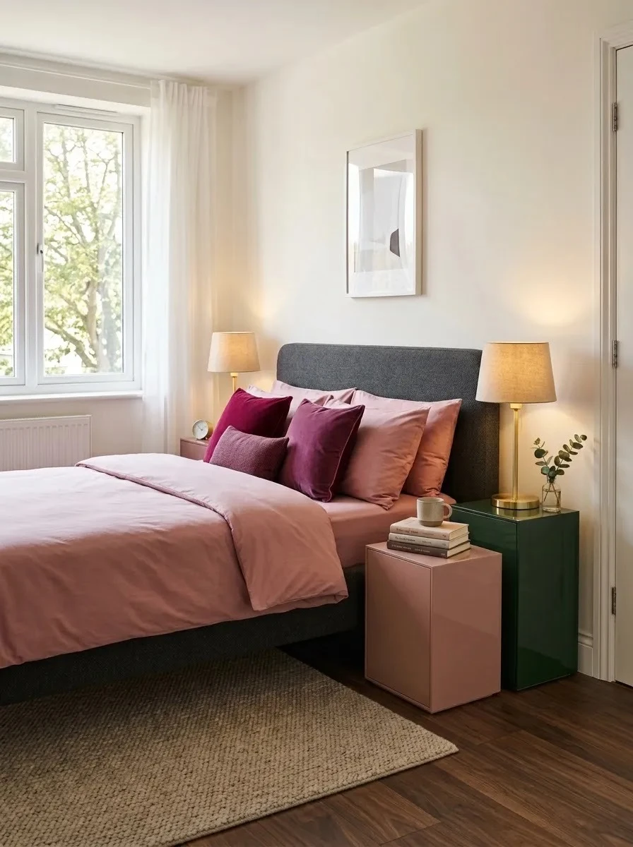
Two Tone Nightstands
- Choose matching nightstand shapes so the different colors still feel connected.
- Paint one piece muted pink and the other deep green for a balanced contrast.
- Use identical hardware to visually tie both sides together.
- Keep lamps simple in brass, black, or smoked glass.
- Repeat each nightstand color once through bedding or artwork.
Two-tone nightstands are useful for adding personality without changing the whole room. The matching shape keeps the setup organized, while the contrasting finishes make it more visually interesting. This works especially well with secondhand furniture because both pieces can be refreshed inexpensively with paint and new hardware.
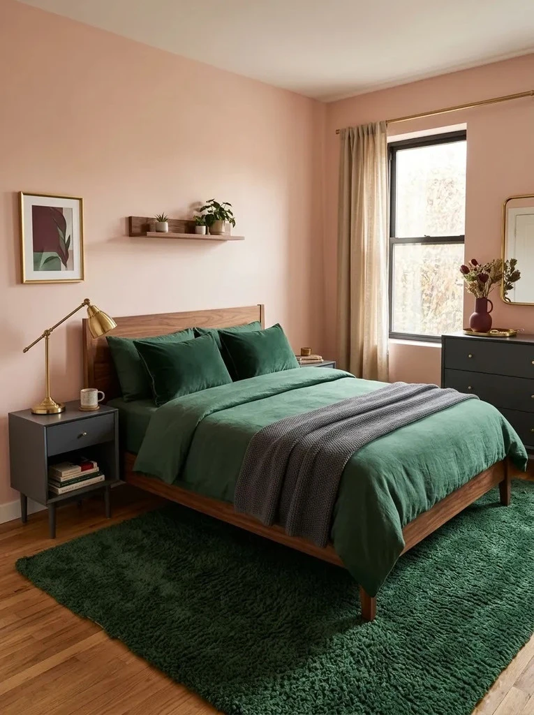
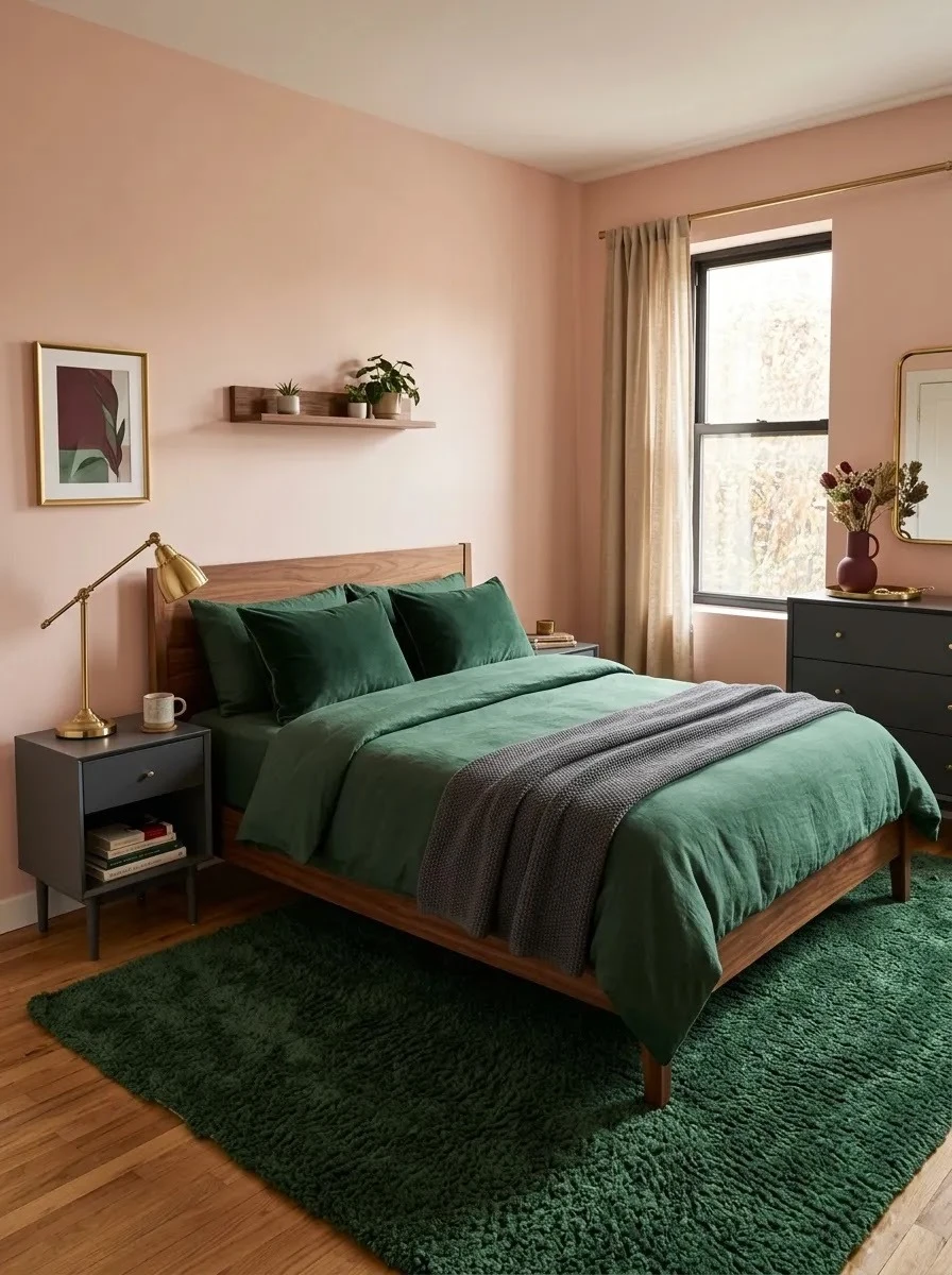
Blush Rug vs Green Rug
| Feature | Blush Rug | Green Rug |
| Visual Effect | Softens darker furniture | Deepens the overall palette |
| Best With | Green bedding and accents | Pink walls and lighter bedding |
| Small Room Feel | Brighter and gentler | Richer and more grounded |
| Maintenance | Hides light dust less easily | Better at disguising minor marks |
The rug can decide whether the room feels softer or more dramatic. A blush option keeps the floor visually light, while deep green creates a stronger base. For small bedrooms, I prefer leaving several inches of visible flooring around the rug so the space does not feel overly filled.
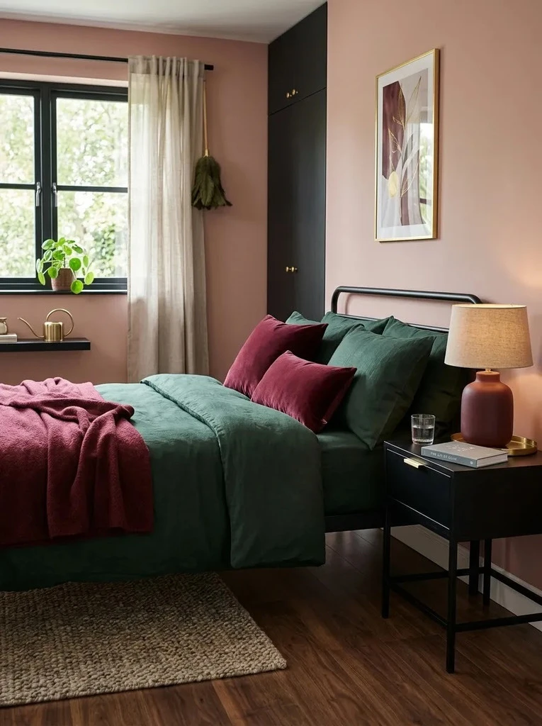
Burgundy Bridge Accents
DO:
- Use burgundy as a supporting shade rather than a third dominant color.
- Repeat it in two or three small areas for visual continuity.
- Choose deeper wine tones that complement forest green.
- Keep larger surfaces focused on pink and green.
DON’T:
- Cover the entire bed in burgundy textiles.
- Mix too many red-based shades in one room.
- Introduce bright scarlet or neon pink accents.
- Use burgundy on every decorative object.
Burgundy works as a useful bridge between pink and dark green because it shares warmth with one and depth with the other. I’ve seen this combination feel especially polished when burgundy appears only in small doses. It adds richness without stealing attention from the main two-color scheme.
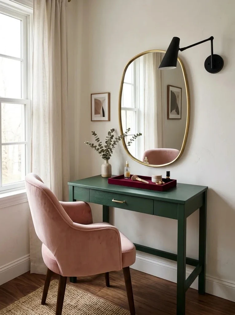
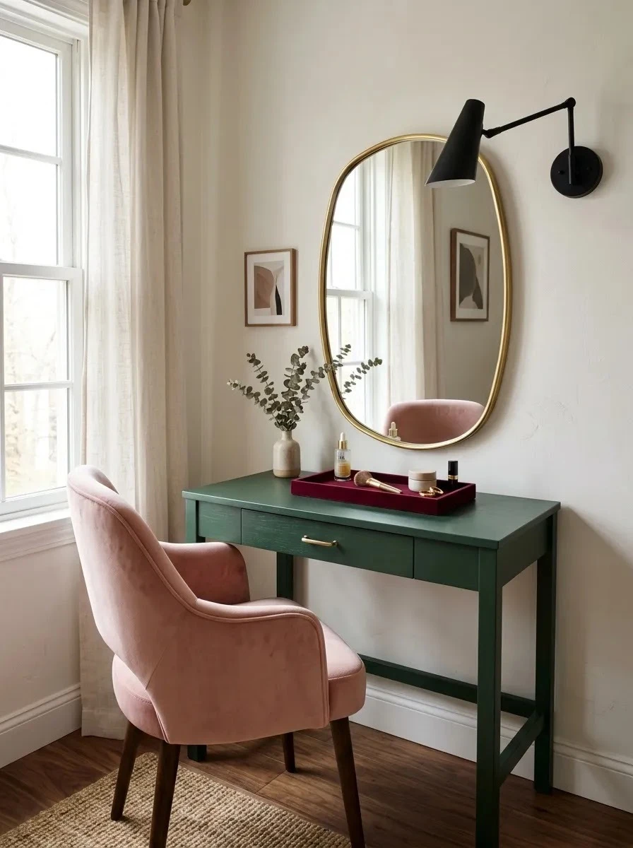
Green Vanity Corner
Cost: Medium
Time: One afternoon
Skill Level: Beginner to Intermediate
Best For: Small bedrooms needing a dedicated getting-ready zone
A compact vanity creates a useful feature without requiring much floor space. Choose a narrow green table and pair it with one blush seat so both colors have a clear purpose. Wall-mounted lighting also keeps the surface open for daily essentials, which helps the setup feel practical rather than decorative only.
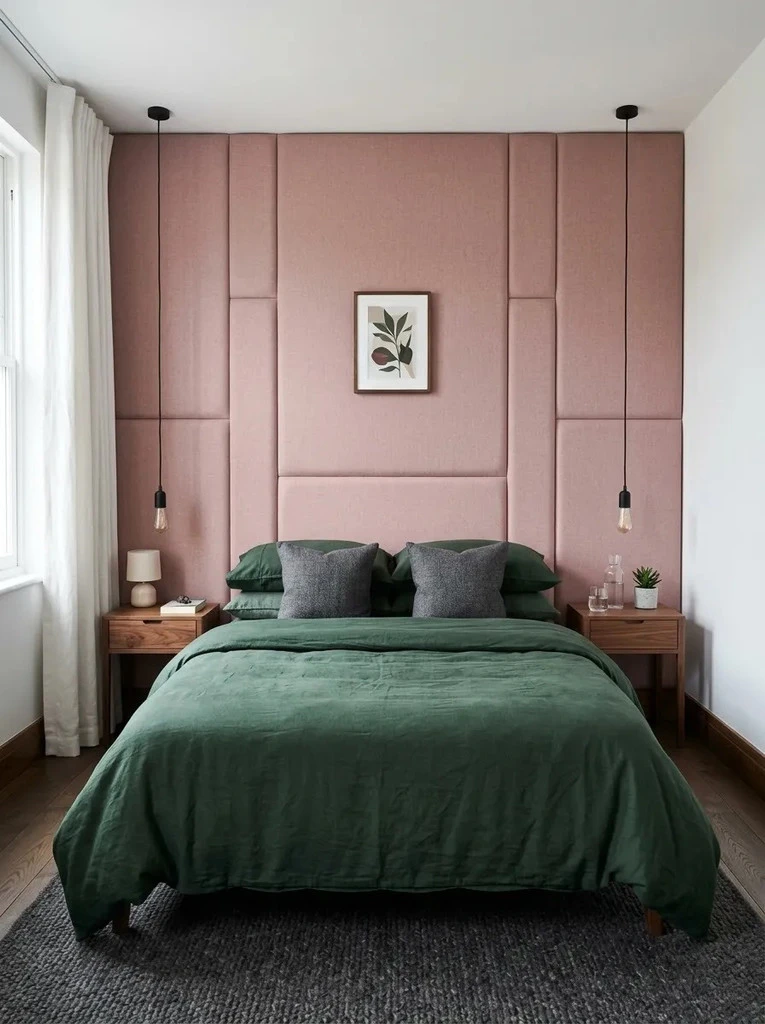
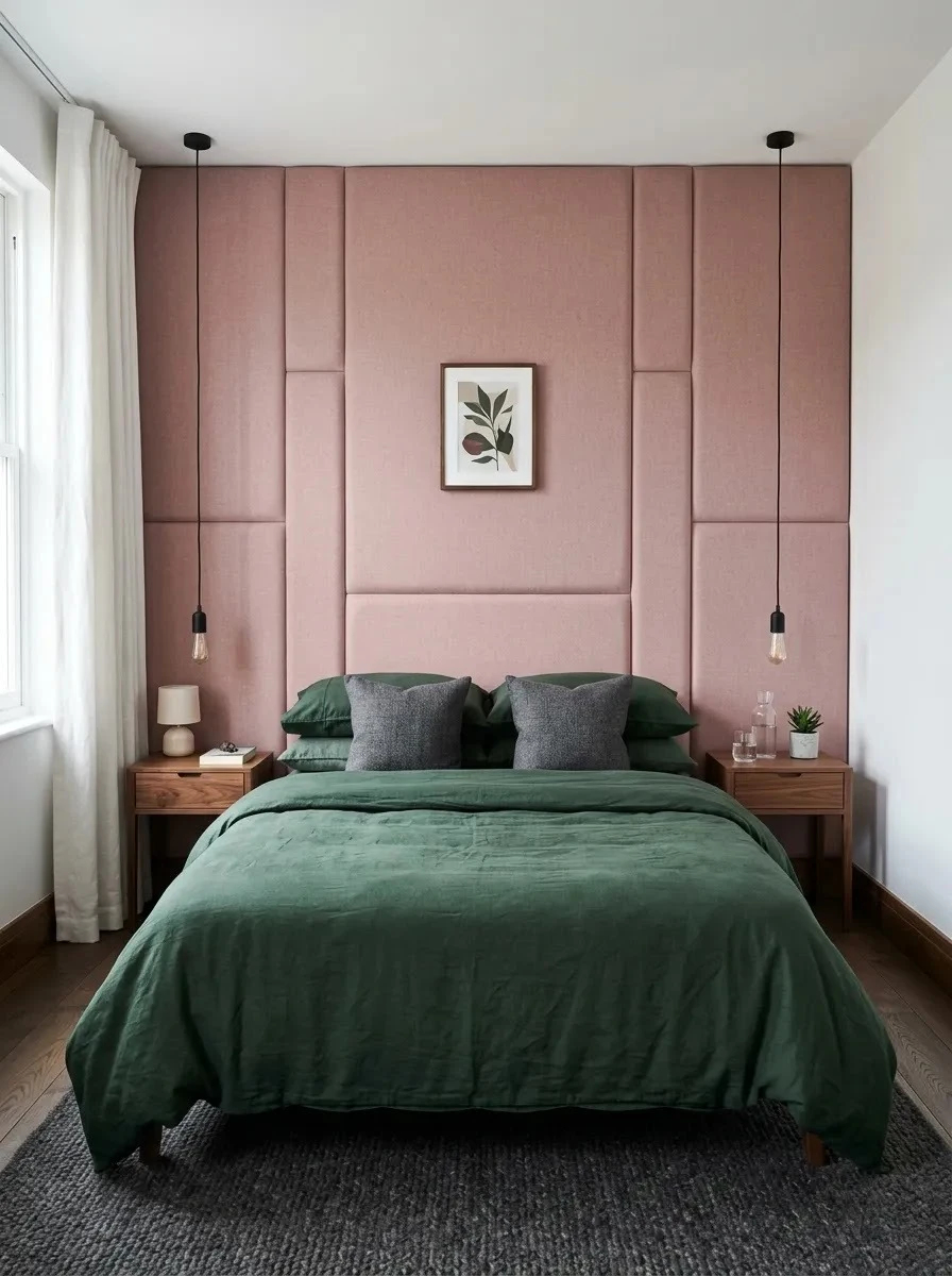
Pink Upholstered Wall
An upholstered pink wall adds softness while giving the sleeping area a strong architectural feature. Vertical panels work especially well because they draw the eye upward and can make a low ceiling feel taller. Deep green bedding creates enough contrast to stop the pink from becoming overly sweet.
In my experience, this treatment feels most successful when the rest of the room stays restrained. Use simple nightstands, limited artwork, and darker accents around the bed. The padded surface also brings extra texture, which means fewer decorative accessories are needed to make the space feel finished.
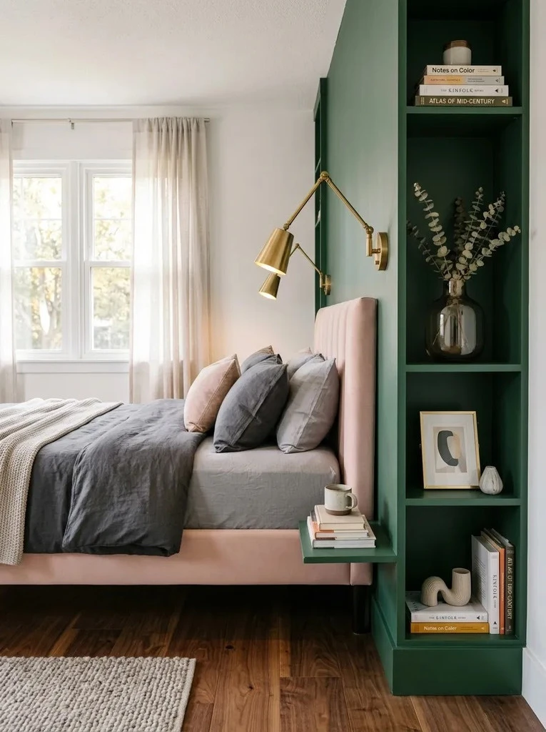
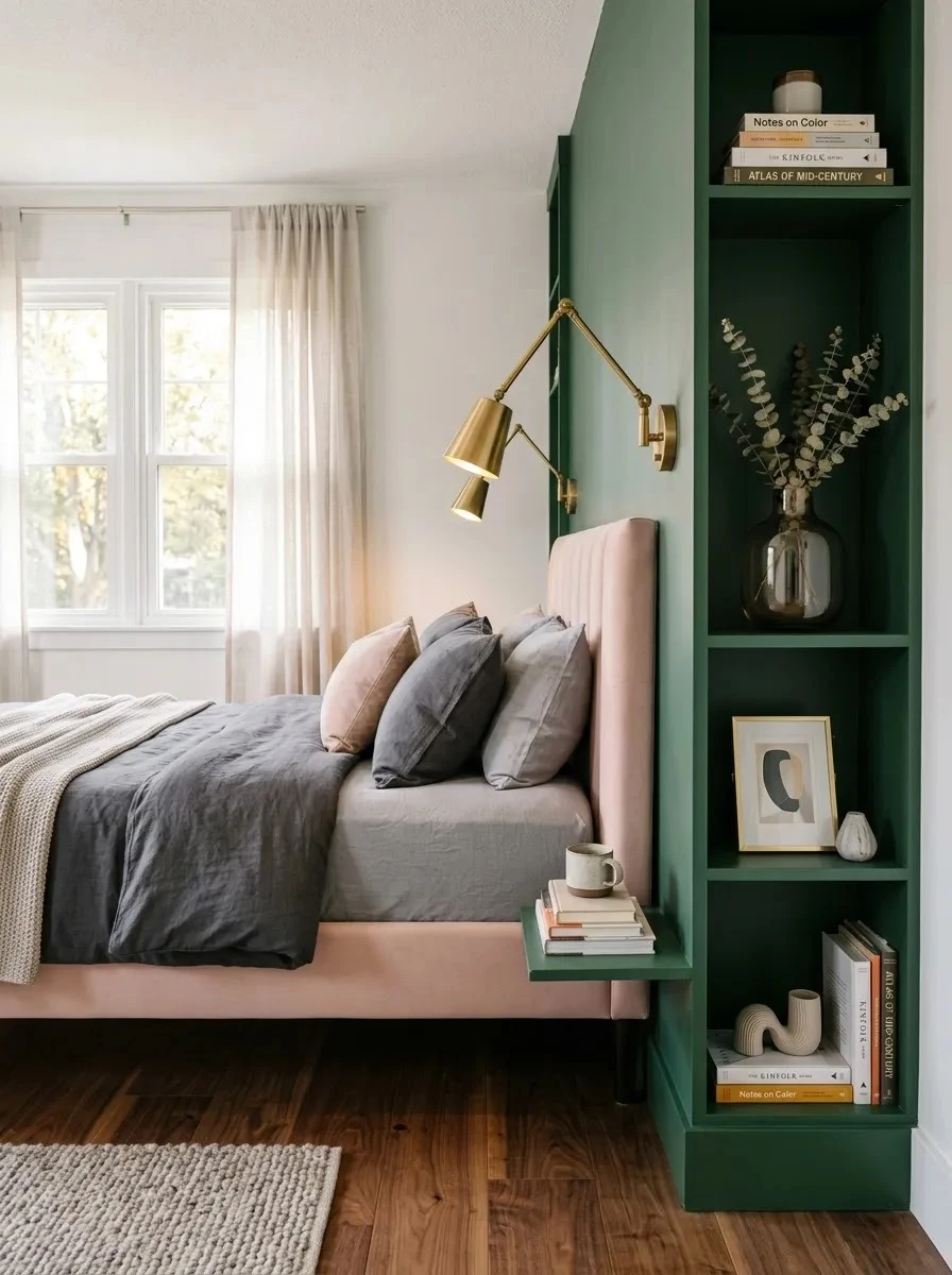
Green Bedside Shelving
- Keep the shelving unit narrow so it adds storage without crowding the bed.
- Paint the shelves and backing in one dark green shade for a clean built-in effect.
- Style only part of each shelf, leaving visible empty space between objects.
- Repeat blush through bedding or one decorative box rather than filling every shelf with pink.
- Add a small reading light to make the storage wall useful at night.
Vertical bedside shelving works especially well where a standard nightstand offers too little storage. It uses wall height instead of valuable floor width and gives books, accessories, and daily items a clear home. Keeping the styling sparse prevents the dark green structure from feeling visually heavy in a compact room.
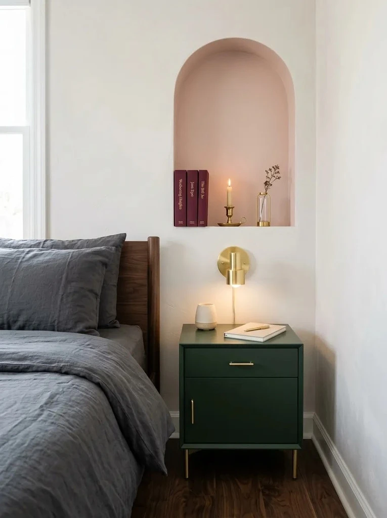
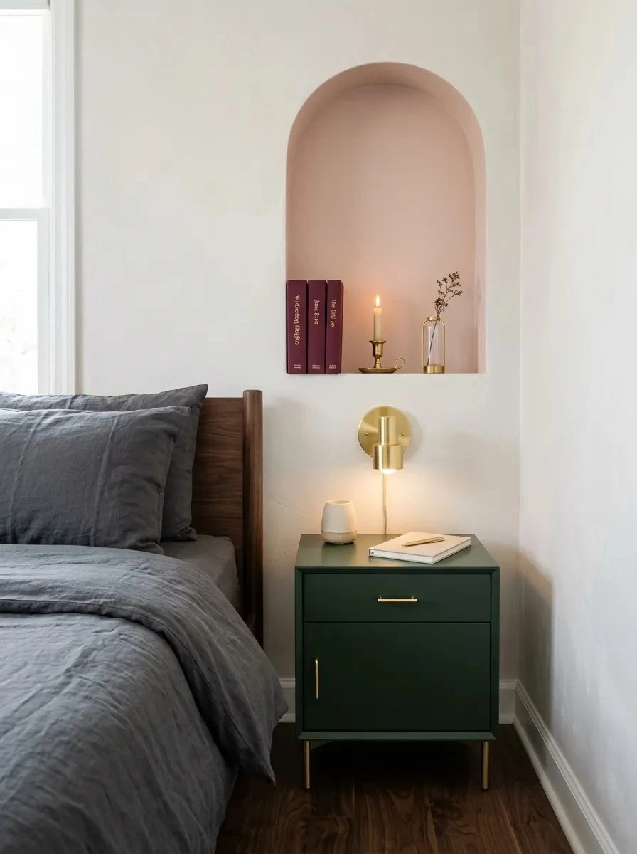
Pink Arch Niche
Quick Tip:
Keep the arch slightly wider than the furniture placed beneath it so the feature feels balanced. A painted arch can also imitate a niche when cutting into the wall is not practical.
A blush arch gives a plain wall more shape without filling it with extra decor. Pairing it with one dark green cabinet creates a strong contrast in a very small footprint. For an inexpensive version, carefully mark the curve with painter’s tape and use leftover wall paint.
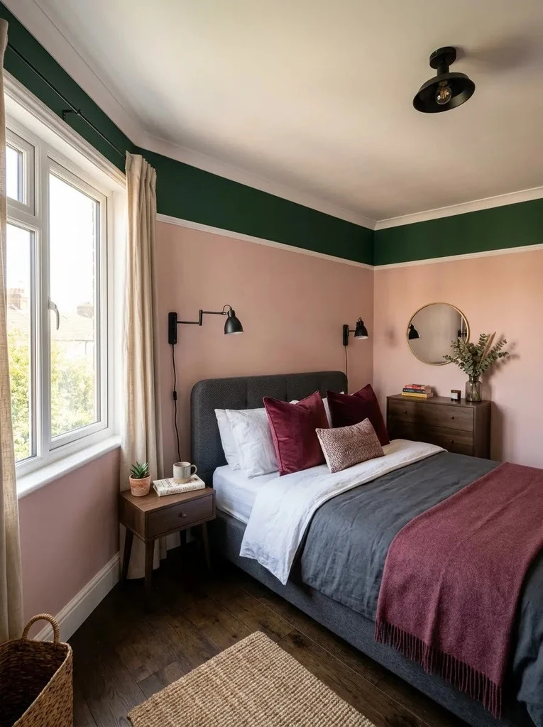
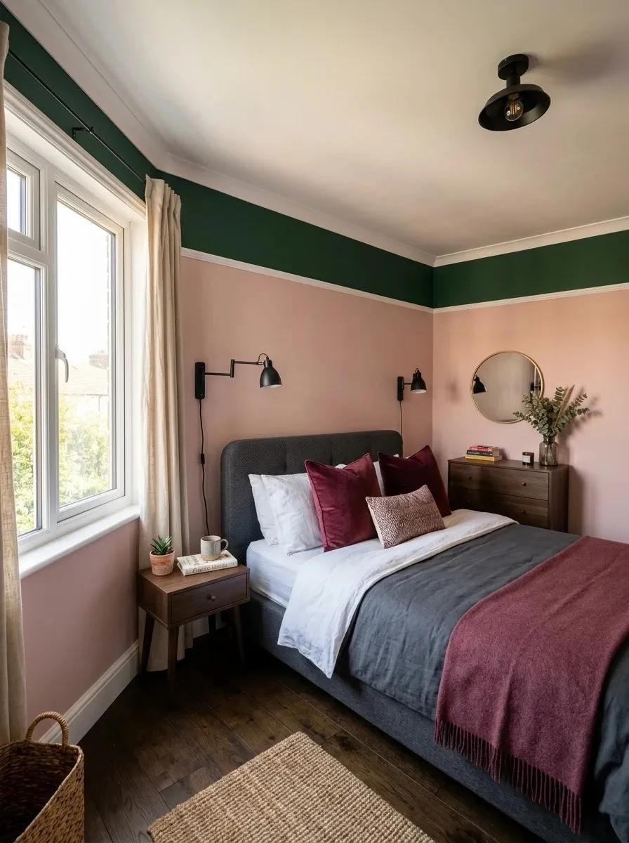
Green Cornice Band
BEFORE:
Plain walls make the two-color palette depend entirely on bedding and accessories. The upper part of the room can also feel visually empty, especially with taller ceilings.
AFTER:
A deep green band wraps around the room and creates a defined architectural border. The dusty pink walls beneath it appear softer while the darker upper edge gives the room more character.
This treatment adds color without committing to completely dark walls. I’ve noticed that keeping the band consistent around the room makes it feel intentional rather than decorative clutter. Measure carefully before painting, and use a level guideline so the edge remains crisp from every viewing angle.
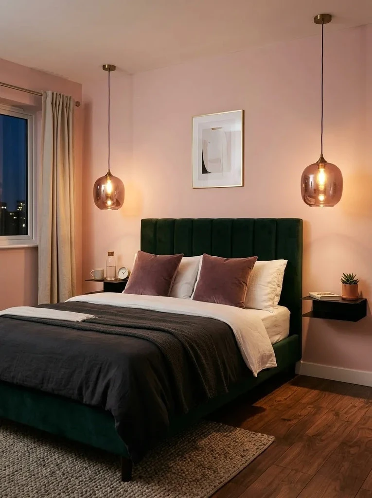
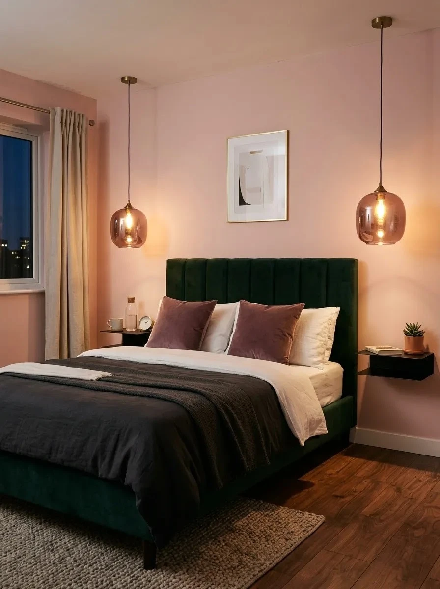
Rose Glass Lighting
- Choose rose tinted glass with a muted smoky finish rather than bright transparent pink.
- Hang pendants beside the bed to free valuable nightstand space.
- Use warm white bulbs so the pink glass does not cast an overly red glow.
- Repeat dark green through the headboard or bedding for balanced contrast.
- Keep nearby accessories simple so the lighting remains noticeable.
Colored glass lighting introduces pink in a less expected way than cushions or throws. It also adds useful vertical interest beside the bed without occupying the floor. Choose fixtures that provide enough reading light as well as atmosphere, since decorative lighting should still serve an everyday purpose in a small bedroom.
Conclusion
Creating a Pink and dark green bedroom does not require an expensive makeover or a completely new set of furniture. Small changes, such as darker curtains, blush textiles, painted storage, statement lighting, or a colorful headboard, can give the room much more character.
I’ve noticed that the most successful spaces usually balance one stronger color with a softer supporting shade rather than treating both equally everywhere. Choose the ideas that suit your room, budget, and personal style, then build from there. Save this post on Pinterest for future inspiration, try your favorite ideas, and share it with someone who is planning a bedroom refresh.